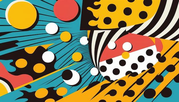
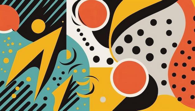
Pop Art, a cultural movement that emerged in the mid-1950s, revolutionized the art world with its vibrant and eye-catching colors. This unique art style, popularized by iconic artists like Roy Lichtenstein and Andy Warhol, continues to captivate audiences around the globe even today. But why exactly are bright colors so prevalent in Pop Art? In this blog post, we will delve into the reasons behind the use of vivid hues in this influential artistic movement.
From primary colors to bold combinations, Pop Art embraces a palette that is loud, energetic, and unapologetic. The use of vibrant colors serves multiple purposes within this art form. Not only do these hues grab our attention, but they also evoke a sense of excitement and immediacy. In a way, the bright colors of Pop Art reflect the spirit of the post-war era, breaking away from the subdued tones of traditional art and instead celebrating the vibrancy of popular culture.
Why Pop Art Embraces Vibrant Colors
Pop Art is known for its bold and vivid colors that seem to jump off the canvas. But have you ever wondered why these artists chose such eye-catching hues? Well, I’m here to spill the beans and reveal the secrets behind the use of bright colors in Pop Art.
Popping Off the Canvas
In the gray and serious world of art, Pop Art emerged like a breath of fresh air, ready to shake things up with its explosion of colors. These vibrant hues weren’t just randomly chosen; they were deliberately employed to grab your attention and make you take a second look.
Art That Speaks
Pop Art was a rebellion against the traditional art world, and what better way to make a statement than with colors that scream, “Look at me!” These artists believed that art should be accessible to everyone, not just highbrow elites. By using bold and bright colors, they aimed to connect with a wider audience, sparking conversations and captivating viewers from all walks of life.
Color Me Happy
Pop Art wanted to inject some joy into people’s lives, and what better way to do that than with a burst of color? It’s no secret that bright and vibrant hues have a way of evoking positive emotions and putting a smile on our faces. In a world filled with monotony and conformity, the vivid colors of Pop Art served as a welcome escape, a visual celebration of life, and an invitation to embrace individuality.
Embracing Consumer Culture
Pop Art was deeply influenced by the rising consumer culture of the 1950s and 1960s. These artists found inspiration in everyday objects and commercial imagery, from Campbell’s soup cans to Coca-Cola bottles. By using bright colors reminiscent of advertisements and product packaging, Pop Art blurred the line between art and commerce, inviting viewers to question the power of consumerism and its impact on our society.
A Captivating Contrast
The use of vibrant colors in Pop Art also served a deeper purpose – creating contrast. By juxtaposing bright hues against mundane or even shocking subjects, the artists hoped to reveal the absurdity of our consumer-driven society. This contrasting effect added another layer of depth to their works, challenging viewers to look beyond the surface and question the world around them.
So, the next time you find yourself mesmerized by a Pop Art masterpiece, remember that behind those vibrant colors lies a powerful message. From grabbing your attention to challenging societal norms, the bold hues of Pop Art continue to captivate and inspire, proving that sometimes, the brightest colors carry the deepest meanings.
FAQ: Why Are Bright Colors Used in Pop Art
Introduction:
Pop Art is a vibrant and iconic art movement that emerged in the 1950s and gained popularity throughout the 1960s. This art style revolutionized the traditional concepts of art by incorporating elements of popular culture and mass media. One of the defining characteristics of Pop Art is the prominent use of bright colors. In this FAQ-style subsection, we will explore why bright colors are used in Pop Art and their significance in this influential art movement.
What Does Vibrant Color Mean
Vibrant colors refer to hues that are intense, bold, and eye-catching. In the context of art, vibrant colors have a powerful visual impact and evoke strong emotions. In Pop Art, artists strategically utilize vibrant colors to create a sense of energy, dynamism, and intensity that reflects the spirit of the era.
Why Did Roy Lichtenstein Use Primary Colors
Roy Lichtenstein, one of the prominent figures in Pop Art, frequently used primary colors such as red, yellow, and blue in his artwork. The use of primary colors allowed Lichtenstein to achieve a visually striking and iconic aesthetic. Primary colors also symbolize the simplicity and directness associated with mass-produced consumer goods, which were often the subjects of Pop Art.
What Colors Are Most Used in Art
Artists have used various colors throughout history, but some colors have become particularly popular. In addition to primary colors, artists often incorporate secondary colors such as purple, green, and orange. These colors offer a wider range of possibilities for artistic expression while still maintaining vibrancy and visual impact.
What Are the Bright Colors in Art
The bright colors typically associated with Pop Art include bold shades of red, yellow, blue, green, and orange. These colors capture attention, exude energy, and convey a sense of excitement, which aligns perfectly with the bold and vibrant nature of Pop Art.
What Was the Purpose of Pop Art
The purpose of Pop Art was to challenge traditional artistic conventions and blur the boundaries between high art and popular culture. Pop Art celebrated and critiqued mass-produced consumer goods, advertising, and celebrity culture while employing bold visual techniques, such as the use of bright colors, to engage audiences and make a lasting impression.
Why Are Vibrant Colors Used
Vibrant colors are used in Pop Art to grab attention and create a visual impact. The bright and bold hues reflect the electrifying energy of the post-war era and the vibrant culture of consumerism. By using vibrant colors, Pop Artists aimed to captivate viewers, convey a sense of excitement, and challenge the notion of what art can be.
What Is the Purpose of Color in Art
Color serves several purposes in art, including evoking emotions, creating visual interest, and conveying meaning. In Pop Art, the purpose of color is to intensify the visual impact and reinforce the themes of popular culture, consumerism, and mass production that are central to the movement.
Why Do Artists Use Bright Colors
Artists use bright colors to provoke emotions, make a bold statement, and create a captivating visual experience. Bright colors are attention-grabbing and help artists convey their message with power and intensity. In the context of Pop Art, the use of bright colors further emphasizes the movement’s rebellion against traditional artistic norms and its embrace of popular culture.
What Color Does Pop Art Use
Pop Art utilizes a wide range of colors, with a strong emphasis on vibrant and eye-catching hues. The color palette includes primary colors (red, yellow, blue), secondary colors (purple, green, orange), and bright variations of these colors. The specific colors chosen often depend on the artist’s personal style and the message they intend to convey.
Why Did Andy Warhol Use Vibrant Colors
Andy Warhol, a pioneering figure in Pop Art, frequently used vibrant colors to amplify the impact of his artwork. He believed that colors had the power to influence perception and create a lasting impression on viewers. Warhol’s use of vibrant colors also mirrored the bright and flashy world of consumerism that Pop Art sought to critique.
Why Is Pop Art So Important
Pop Art is important because it challenged traditional artistic conventions, democratized art by embracing popular culture, and made art accessible to a wider audience. Through its vibrant colors and bold imagery, Pop Art presents a powerful commentary on the social, cultural, and political landscape of its time. Its influence can still be seen in contemporary art and popular culture.
Are Colors Tertiary
While primary and secondary colors are more widely known, tertiary colors also play a significant role in art. Tertiary colors are created by mixing primary and secondary colors. Artists often explore tertiary colors to expand their palette and achieve nuanced and sophisticated shades that add depth and complexity to their artwork.
What Does Pop Art Represent
Pop Art represents a departure from traditional artistic approaches and embraces the mass culture and consumerism of the post-war era. It critiques the notion of high art by incorporating elements from popular culture and mass media. Pop Art reflects the democratization of art and challenges the idea that art must be serious or elitist.
What Are Bright Colors
Bright colors refer to saturated, vivid, and intense hues that catch the eye and create a sense of energy and vitality. In Pop Art, bright colors are used to convey the excitement, vibrancy, and consumer-driven culture of the era. They draw attention, provoke emotions, and reinforce the rebellious and bold nature of the movement.
What Do Vibrant Colors Represent
Vibrant colors represent a range of emotions and concepts depending on the context. In the context of Pop Art, vibrant colors represent energy, excitement, consumerism, and the bold statement that the movement aimed to make. They also symbolize the visual language of advertising, comic books, and popular culture that Pop Art drew inspiration from.
What Are the Color Schemes Used for Pop Art
Pop Art utilizes various color schemes, including complementary, analogous, and monochromatic schemes. Complementary color schemes involve using colors that are opposite each other on the color wheel, creating contrast and vibrancy. Analogous color schemes involve using colors that are adjacent to each other on the color wheel, creating harmony and cohesion. Monochromatic schemes involve using variations of a single color, providing a visually cohesive and impactful effect.
What Bright Colors Mean
Bright colors have different meanings depending on cultural and personal associations, but in the context of art, they generally represent energy, vitality, excitement, and youthfulness. In Pop Art, bright colors are used to convey these qualities while challenging traditional notions of what art should be.
What Is Unique About Pop Art
One of the unique aspects of Pop Art is its ability to bridge the gap between high art and popular culture. By incorporating everyday objects, consumer goods, and imagery from mass media, Pop Art offers a fresh and accessible perspective on art. The use of bright colors further distinguishes Pop Art, captivating audiences and making a strong visual impact.
What Do Bright Colors Do in Art
Bright colors in art serve multiple purposes. They grab attention, create visual impact, evoke emotions, and make a lasting impression. In Pop Art specifically, bright colors are used to engage viewers and convey the energy and excitement associated with consumer culture, media, and popular icons.
Why Did Warhol Use Bright Colors
Andy Warhol, known for his iconic works featuring celebrities and consumer products, used bright colors to enhance the visual impact of his art. Warhol believed that using bright colors would make his work memorable and draw attention to his subjects. The bold hues also mirror the vivid and attention-grabbing nature of the mass media and advertising that Warhol explored in his art.
Why Is Pop Art So Bright
Pop Art is inherently bright because it draws inspiration from the vivid colors used in popular culture, mass media, and consumer goods. Pop Artists aimed to create visually striking artwork that would captivate viewers and challenge traditional artistic norms. Bright colors were the perfect tool to achieve this, as they embody the boldness and excitement of the post-war era.
What Colors Are Used in Pop Art
Pop Art employs a wide range of colors, but some of the most commonly used ones include vibrant shades of red, yellow, blue, green, orange, purple, and pink. These colors, either used individually or in combination, contribute to the energetic and eye-catching aesthetic that defines Pop Art.
What Is the Importance of Color in Artwork
Color plays a crucial role in artwork, as it has the power to evoke emotions, convey meaning, and create visual interest. It can enhance the narrative, set the mood or atmosphere, and communicate the artist’s intention. In Pop Art, color is of particular importance as it amplifies the movement’s message, draws attention, and reinforces the connection to popular culture.
In this FAQ-style subsection, we’ve explored why bright colors are utilized in Pop Art and their significance in this influential art movement. From the bold choices of Roy Lichtenstein to the vibrant world of Andy Warhol, bright colors have served as a visual language that captivates and challenges the norms of traditional art. By employing vivid hues, Pop Art continues to make a lasting and colorful impact in the art world even today.